Working title: “Using D3 flame charts to provide insight into the largest components of large, variable JSON objects”.

Summary
I’ve written a tool to visualize the size of a JSON object. It takes any JSON object as input and creates a JSON format which D3 can consume to create a flame chart representing the size of the JSON and all of its subobjects. In the simplified example above, you can see that the “friends” object in the list clearly should be the first optimization target.
Code, example data, and README is available at https://github.com/Jwonsever/json_flame.
Inspiration partly goes to https://github.com/spiermar/burn and https://github.com/spiermar/d3-flame-graph, which is used to convert profiler output to flame charts, partly to YourKit and JProfiler, and partly to the Chrome Dev Tools performance analysis. All of which provide great insight into performance problems using flame charts.
The Story
This should be a quick little read. I was a Performance Engineer for the first couple years of my career, and while I no longer want to work on software performance every day, sometimes there is a problem that comes up that piques my interest. This post is about one.
One of the most common performance problems, present in practically every web application, is an excess of data. Obviously, the less code you have to download, the faster your site will load. It’s very easy to see how much time is spent downloading using Chrome Dev Tools, just go to the network tab, and look at the blue bar!
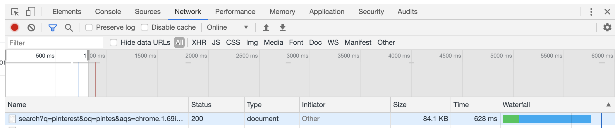
The green represents server time processing, and the blue is download time. In that time, neither the server nor the client is doing any work, and that waiting time is critical to optimize. While there are tons of types of data being sent to the web client, any of which can be too large, I’ve found that excessively large JSON objects come up often and are one of the easiest problems to target.
I recently ran into a problem where I had an extremely complicated JSON object which I didn’t know the structure of. I simply wanted to diagnose which subobject were the largest contributors, so I know where to focus my optimization first. This is a common pattern, (Chrome memory and performance analysis give tools for this, its commonly used for profiling, etc.) Most engineers have seen flame charts in the past and used them for such purposes. Surprisingly, I wasn’t able to find a way to visualize the components of JSON in this way, so I built one. Given it really only took a couple hours to get the first version of it working, I’m still in disbelief that this didn’t already exist. Maybe I just wasn’t trying hard enough to find it.
The Tool
The tool is relatively simple. It takes an input JSON, generates an out.json file with the performance data, then starts a local express node app to visualize the data using D3 using d3-flame-graph.
Without any optional parameters, you will see every composite object. Unfortunately, that output often is impossible to read:

It’s a long array of the same object. Long lists of items are common and thus I added an extra mode: “(-a)ggregate mode”.
Aggregate mode goes through an array and acts as if each of its child objects are the same object, summing up their contributions into a single object.
This lets you take the first graph, and coalesce it into something much easier to parse visually:

I also added another optional mode: “(-k)eys mode”. The difference there is only that the objects keys are included in its representation. This makes a big difference if you are looking to determine excessively long keys and their contributions to the greater object. Generally, I find it provides a clearer representation to what is going on in the object, so I recommend using it as well.
Next Steps
This seems like it should be a SAAS tool that I should put online somewhere for people to use. If anyone wants to see that, please contact me! Maybe we can work something out.
Right now, the code abuses JSON parse and JSON stringify to determine the size of the JSON object. Ideally, the blob would be measured directly, so all of the supplied whitespace would be accounted for. There’s a placeholder file “measure_without_json_parse.js” which marks this todo item.
There will be a second blog soon called something like “Minifying JSON” with another cute trick to make JSON a little smaller. Watch out for it in the next couple weeks!